Konstellation & DARC Branding Update —Infrastructure for the DeFi Capital Markets🚀

We recently decided to make updates to our branding and are excited to tell you about it. We feel that this new brand identity will more accurately reflect our vision for the Konstellation ecosystem and our company.
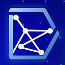
First, we determined that our old logo was too simple, so we have enhanced it as displayed in the image below, giving it a bit more flare and making sure we are able to highlight Konstellation as a core element of the DARC token ecosystem.

Here is a more detailed image of the dimensions and a description of how we went about altering the Konstellation logo.

The old logo had a thin, unbalanced font so our design team made the logotype bolder and completed calculations in order to make sure the new logo balanced with the logogram. For the logogram itself, we made the connected dots more organized and neat instead of placing them in a random pattern like how they used to be.
The Meaning Behind The Logo Design
The arrangement is strategic and represents the shape of an archery bow to symbolize that we are aiming to be the best in our field.
The connected dots also symbolize blockchain technology and the internet which enable us to be connected to each other. They also symbolize a group of stars, also known as a constellation, which is the origin of the Konstellation name.
The solar eclipse moon behind the logogram symbolizes that we are currently in an era of transformation with regard to the future of technology.
More details related to the logo concept can be found below:
Konstellation Logo Concept
Solar eclipse
Symbolizes the transformation we are undergoing to the new era of technology.

Constellation
The origin name of Konstellation. A group of stars. Symbolizes the hope and value that we bring to our products. We envision that our products will be just like the stars that give us light in the dark of night.

Connected
Symbolizes that the internet and blockchain technology allow us to be connected to each other.

Coin
Symbolizes “Finance” which is the core aspect of Konstellation’s business.

Archery
Symbolizes that we’re aiming to be the best.


DARC Token

As the core of the Konstellation ecosystem, DARC has the most important role. It’s like the circuit for everything. That’s why a “circuit” became the concept for the DARC token logo.
Power circuits transfer and control large amounts of electricity. Electronic circuits, on the other hand, are responsible for processing and transmitting information.
Just like a circuit, DARC is the main collateral for every transaction, whether it’s being used for a transfer, staking, or for transmitting information within the ecosystem.
The logo’s colors and feel match with Konstellation’s brand colors because DARC and Konstellation are one and can’t be separated.
Last but not least, the shape of the logogram itself represents “D” for DARC.


Comments and questions? Send the team an email here: info@konstellation.tech
To keep up with Konstellation attend one of our scheduled AMAs and follow us on:
Twitter | Facebook | LinkedIn | Telegram (Official) | Telegram (Announcements)|Medium| Kakao | or visit us on https://konstellation.tech